This article presents the “Unbraided Ribbon Problem” in which
geom_ribbon() incorrectly fills the area between two
alternating lines with two different colors. To fix the problem, we use
geom_braid() from ggbraid with
method = 'line'.
Let’s compare the temperatures of two cities in the United States: New York, New York and San Francisco, California.
Getting Started
ggbraid provides a data frame called temps, with daily
average temperatures of New York and San Francisco in 2021 as recorded
by the US National Weather Service (NWS) at weather.gov.1
library(ggplot2)
library(ggbraid)
library(dplyr)
library(tidyr)

data(temps)

temps
#> # A tibble: 730 × 3
#>    city     date         avg
#>    <chr>    <date>     <dbl>
#>  1 New York 2021-01-01  36.5
#>  2 New York 2021-01-02  43.5
#>  3 New York 2021-01-03  36
#>  4 New York 2021-01-04  39
#>  5 New York 2021-01-05  39
#>  6 New York 2021-01-06  37.5
#>  7 New York 2021-01-07  35.5
#>  8 New York 2021-01-08  32
#>  9 New York 2021-01-09  30.5
#> 10 New York 2021-01-10  35
#> # … with 720 more rows
city is New York or
San Francisco, date is a calendar date in the
YYYY-MM-DD format, and avg is the average
temperature recorded in degrees Fahrenheit (°F) and rounded to the
nearest half degree.2
What do the daily average temperatures look like?
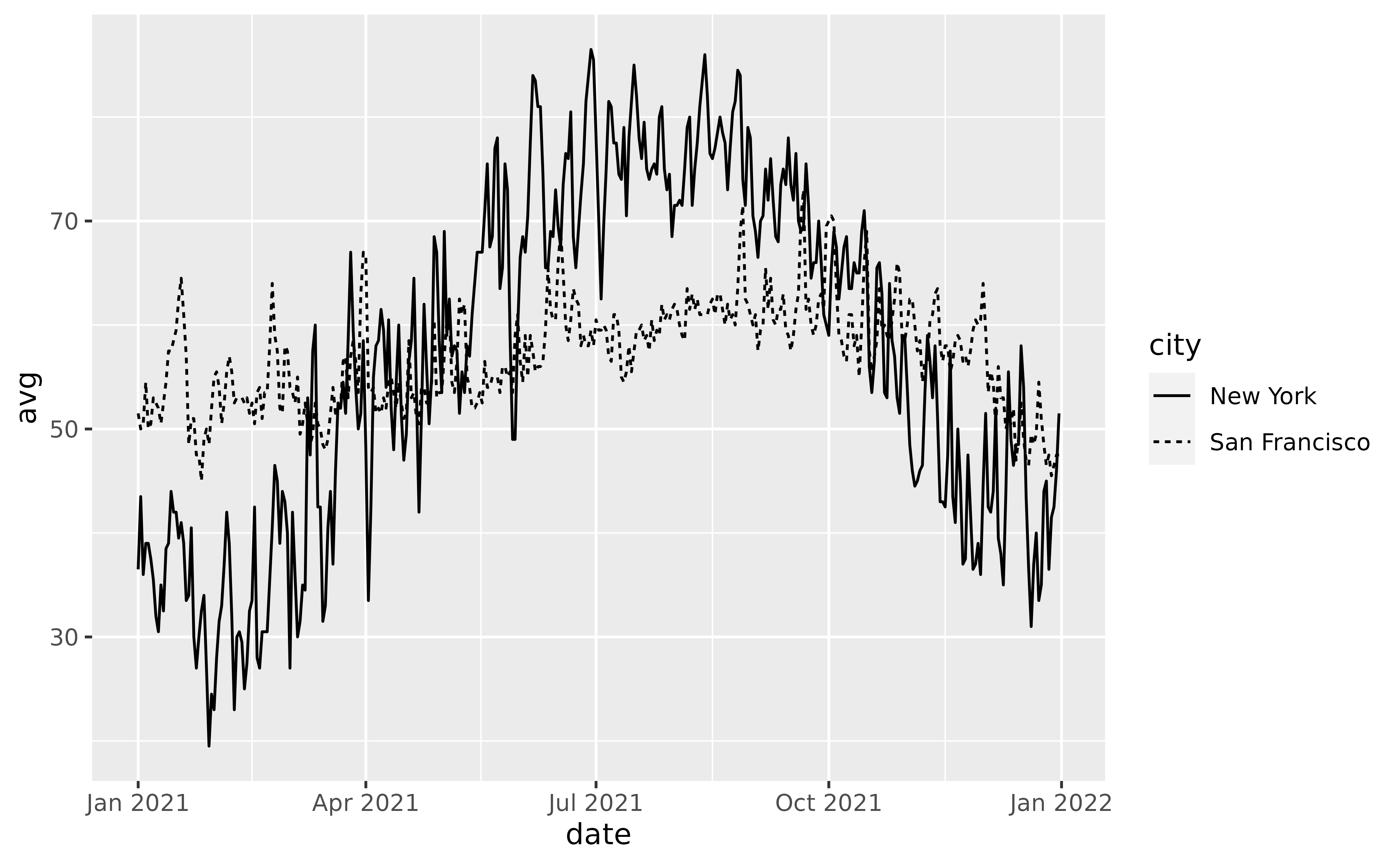
We see much higher variability in temperatures in New York compared with San Francisco. This makes sense — New York is in the Northeastern US and experiences hot, humid summers and cold, occassionally snowy winters. San Francisco is on the West Coast and its Mediterranean climate means its temperature does not change much season to season.
Before we proceed further, let’s clean up the plot a bit and assign
it to a variable p so we can reuse it throughout the
article.
p <- ggplot() +
  geom_line(aes(x = date, y = avg, linetype = city), data = temps) +
  scale_x_date(date_breaks = "1 month", date_labels = "%b") +
  scale_y_continuous(
    breaks = seq(20, 90, by = 10),
    labels = function(x, ...) format(paste(x, "°F"), ...),
    limits = c(18, 90)
  ) +
  guides(fill = "none") +
  labs(
    title = "Average Daily Temperatures in 2021",
    linetype = NULL,
    y = NULL,
    x = NULL
  ) +
  theme_minimal(base_size = 14) +
  theme(
    plot.title = element_text(size = 15),
    plot.title.position = "plot",
    legend.position = c(0.75, 1.06),
    legend.direction = "horizontal",
    legend.key.size = unit(2, "line"),
    legend.text = element_text(size = 12),
    panel.grid.major.x = element_line(linewidth = 0.4),
    panel.grid.major.y = element_line(linewidth = 0.4),
    panel.grid.minor.x = element_blank(),
    panel.grid.minor.y = element_blank()
  )

p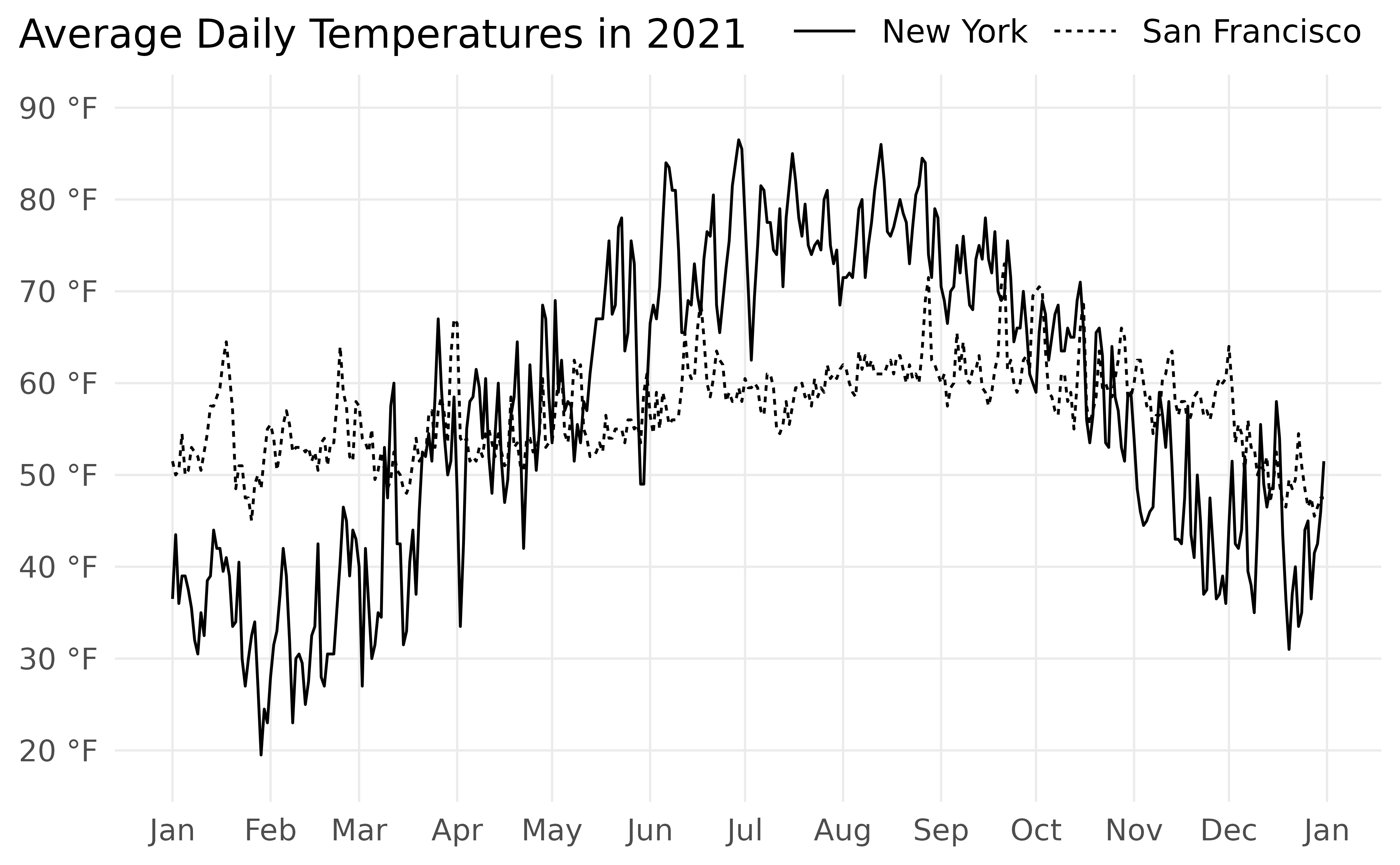
Much better.
Fun with Ribbons
Let’s fill the area between the two lines. We can do so with
geom_ribbon() from ggplot2.
geom_ribbon() requires three aesthetics: x,
ymin, and ymax. We can map date
to x as we did in geom_line(). However, we’ll
need to transform temps to create new variables that we can
map to ymin and ymax.
We can pivot temps with pivot_wider() from
the tidyr package, taking column names from
city and values from avg. Call the new data
frame temps_wide.
temps_wide <- temps %>%
  pivot_wider(names_from = city, values_from = avg) %>%
  rename(ny = `New York`, sf = `San Francisco`)

temps_wide
#> # A tibble: 365 × 3
#>    date          ny    sf
#>    <date>     <dbl> <dbl>
#>  1 2021-01-01  36.5  51.5
#>  2 2021-01-02  43.5  50
#>  3 2021-01-03  36    50.5
#>  4 2021-01-04  39    54.5
#>  5 2021-01-05  39    50
#>  6 2021-01-06  37.5  50.5
#>  7 2021-01-07  35.5  53
#>  8 2021-01-08  32    52.5
#>  9 2021-01-09  30.5  52
#> 10 2021-01-10  35    50.5
#> # … with 355 more rows
Now we can add a new layer to p with
geom_ribbon() using temps_wide. Map
date to x, ny to
ymin, and sf to ymax.3 Finally,
add some transparency with alpha = 0.3.
p +
  geom_ribbon(
    aes(x = date, ymin = ny, ymax = sf),
    data = temps_wide,
    alpha = 0.3
  )
Great! Using geom_ribbon() we’ve added a light grey
ribbon that runs between the two lines.
On second thought… what if we used two colors for the ribbon? We could have one color when New York is hotter than San Francisco and another color when New York is colder than San Francisco.
This shouldn’t be hard to do. Map sf > ny to
fill in geom_ribbon() and…
p +
  geom_ribbon(
    aes(x = date, ymin = ny, ymax = sf, fill = sf > ny),
    data = temps_wide,
    alpha = 0.7
  )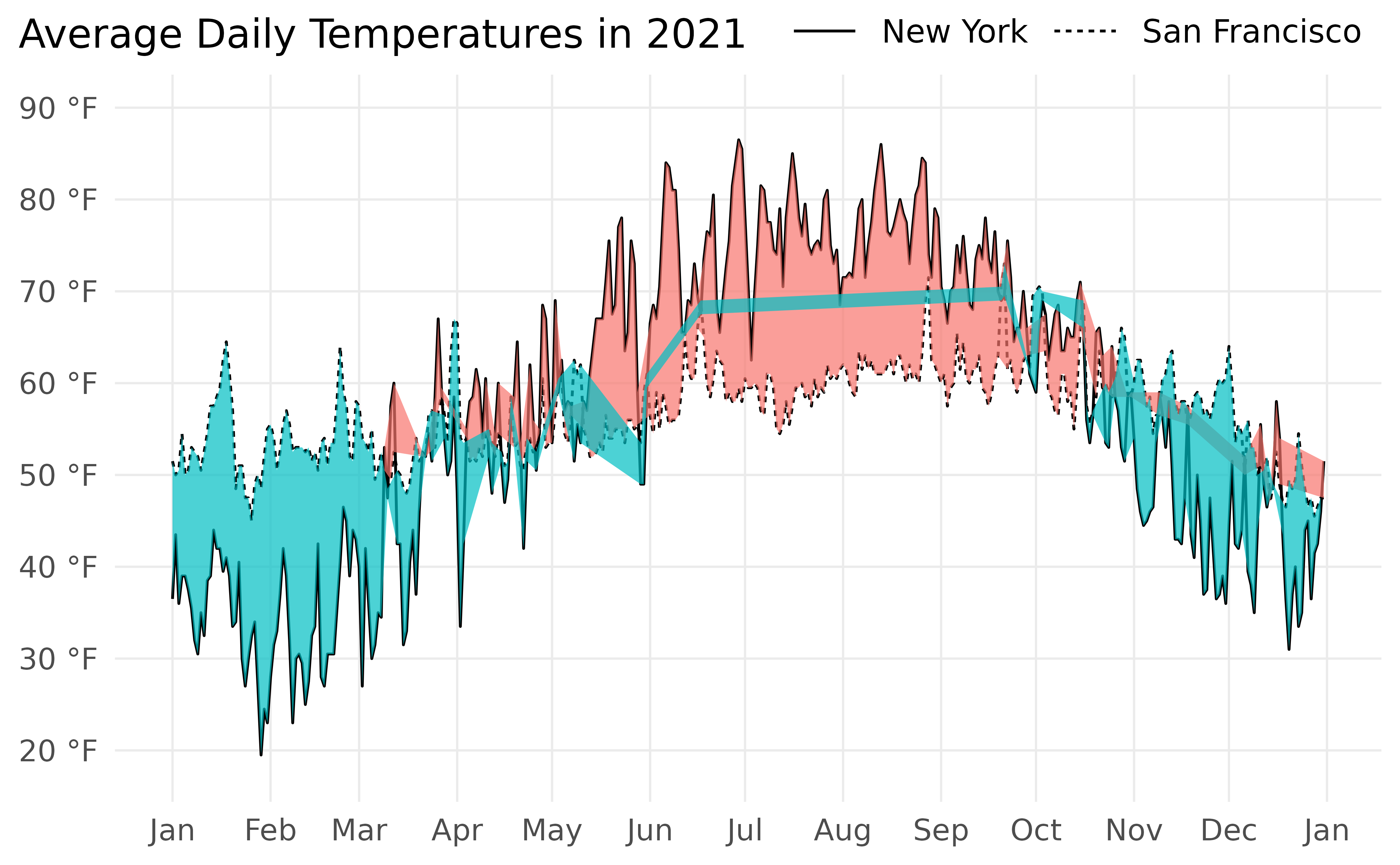
Chaos.
What happened? Is this a bug in geom_ribbon()?
No, it’s not a bug. The problem is that we haven’t dealt with line intersections properly. I call this the Unbraided Ribbon Problem.
The Unbraided Ribbon Problem
Consider rows 80-82 from temps_wide:
| date | ny | sf |
|---|---|---|
| 2021-03-21 | 52.5 | 52.0 |
| 2021-03-22 | 52.0 | 52.0 |
| 2021-03-23 | 54.5 | 56.5 |
After we pass temps_wide to geom_ribbon()
and map date to x, ny to
ymin, sf to ymax, and
sf > ny to fill, we get the following:
| x | ymin | ymax | fill |
|---|---|---|---|
| 18707 | 52.5 | 52.0 | FALSE |
| 18708 | 52.0 | 52.0 | FALSE |
| 18709 | 54.5 | 56.5 | TRUE |
(x is the integer representation of date,
the number of days since January 1, 1970, the “Unix epoch”)
Ok, note the middle row. ymin and ymax are
equal here, so this is a point where the two lines intersect. It turns
out that geom_ribbon() requires two rows for every line
intersection, one row where fill is FALSE and
another row where fill is TRUE.
So we must insert a new row in the data, yielding the following:
| x | ymin | ymax | fill |
|---|---|---|---|
| 18707 | 52.5 | 52.0 | FALSE |
| 18708 | 52.0 | 52.0 | FALSE |
| 18708 | 52.0 | 52.0 | TRUE |
| 18709 | 54.5 | 56.5 | TRUE |
We call this process braiding.
We need to braid the ribbon where the lines intersect.
And the intersection described here is not the only type that requires braiding.
There are instances where the two lines intersect between
two rows in the data. In these cases, we must use a mathematical formula
to determine the exact point at which the lines intersect and braid the
ribbon accordingly. There are also instances where both lines are
vertical at the same x, an uncommon situation but one that
produces an infinite number of intersection points and requires braiding
to fix.
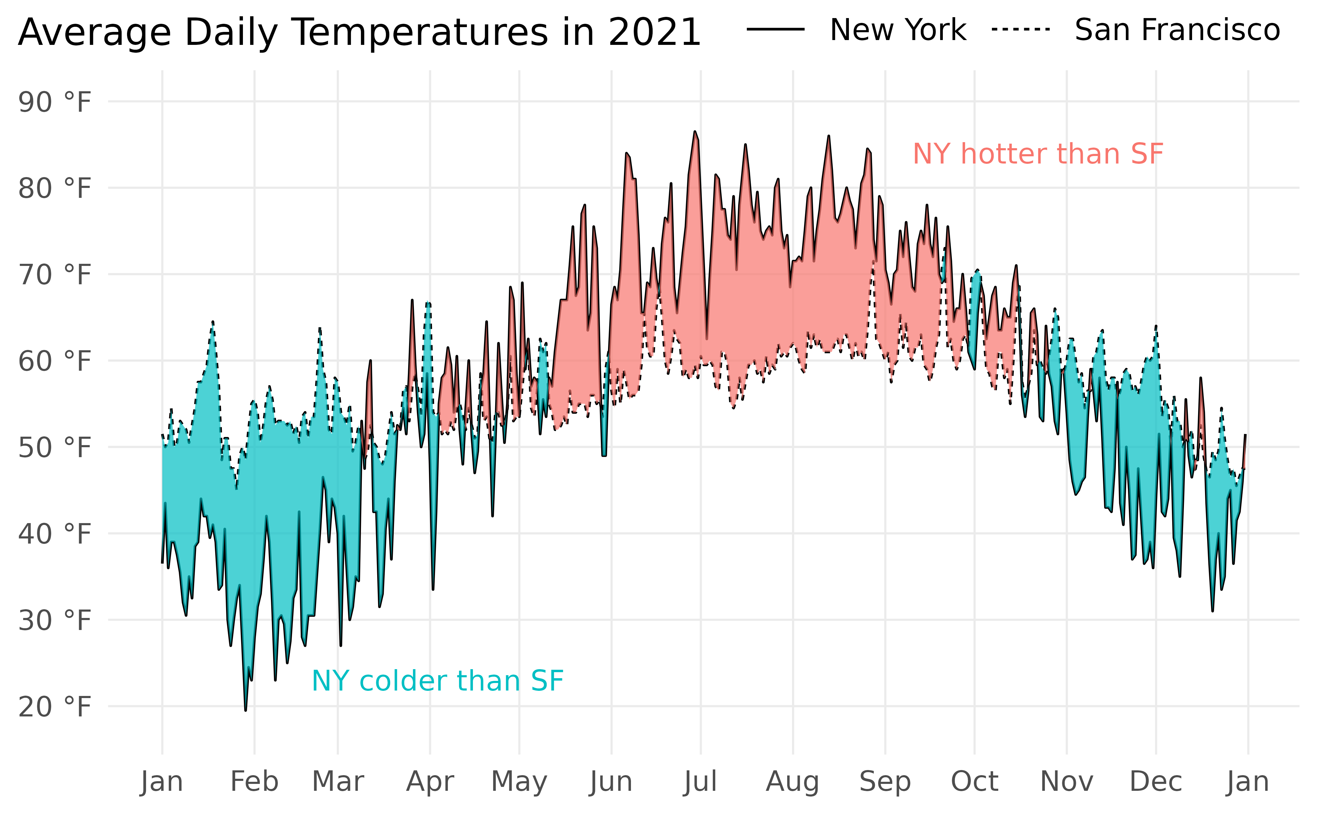
Braiding Ribbons with ggbraid
The functions in ggbraid take care of all the braiding for you.
Simply replace geom_ribbon() with
geom_braid().
p +
  geom_braid(
    aes(x = date, ymin = ny, ymax = sf, fill = sf > ny),
    data = temps_wide,
    alpha = 0.7
  )
#> `geom_braid()` using method = 'line'
There we go!
Notice the message from geom_braid() that it is using
method = 'line'. Since we’ve drawn lines with
geom_line() we must use method = 'line' to
determine the point at which the lines intersect when the intersection
occurs between two rows in the data. We can silence this message by
explicity including method = 'line' within
geom_braid().
geom_braid() takes the data provided, performs the
necessary braiding operations on it with stat_braid(), and
passes the result to geom_ribbon() for drawing. If we’d
like, we can still use geom_ribbon() and set
stat = 'braid'.
p +
  geom_ribbon(
    aes(x = date, ymin = ny, ymax = sf, fill = sf > ny),
    data = temps_wide,
    stat = "braid",
    method = "line",
    alpha = 0.7
  )
This is the same plot as before. We’ve also silenced the message by
including method = 'line'.
Finally, it may be helpful to label the ribbon colors so it’s clear
what they represent. This can happen in a legend (which we’ve turned off
with the guides(fill = "none") layer in p).
Another possibility is to provide text annotations on the plot.
hues <- scales::hue_pal()(2)  # ggplot2 default color palette

p +
  geom_braid(
    aes(x = date, ymin = ny, ymax = sf, fill = sf > ny),
    data = temps_wide,
    method = "line",
    alpha = 0.7
  ) +
  annotate("text", x = as.Date("2021-09-10"), y = 84, size = 4, label = "NY hotter than SF", hjust = 0, color = hues[1]) +
  annotate("text", x = as.Date("2021-02-20"), y = 23, size = 4, label = "NY colder than SF", hjust = 0, color = hues[2])